While I encourage trying out each step for yourself, feel free to copy the pattern HTML from Gist and paste it directly into the editor.
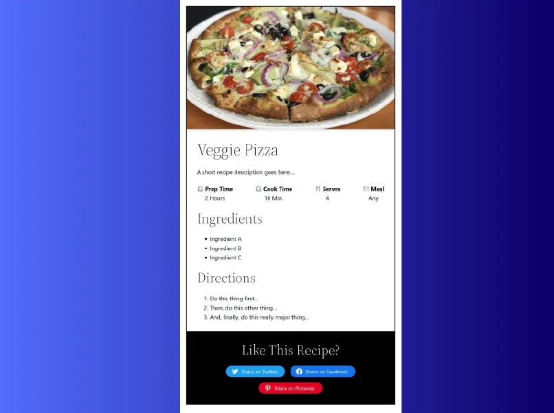
When finished, your recipe card should look similar to the following:
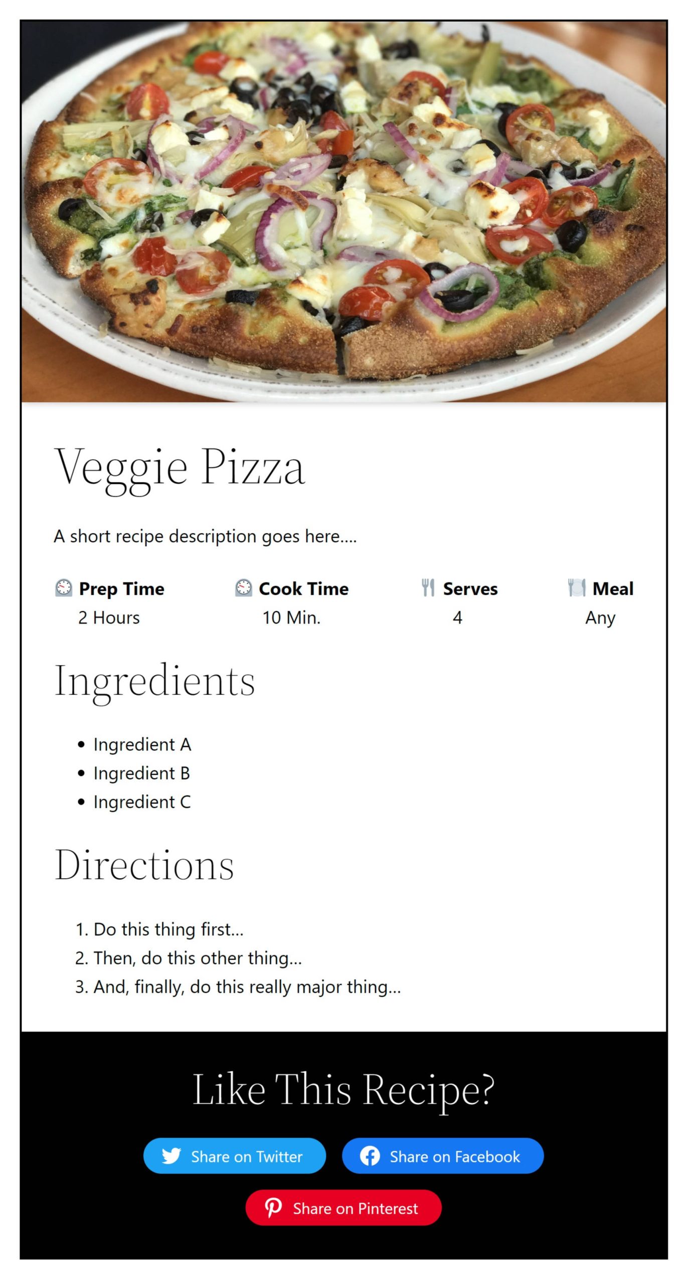
For this Building with Blocks tutorial, We will walk through each step for creating a simple recipe card. This recipe card was created in the Twenty Twenty-Two theme, and only black and white were used for the text, background, and border colors so that it transfers across as many themes as possible.
Building a Recipe Card
The final step of this walkthrough requires the Social Sharing Block plugin by Nick Diego. If you prefer to stick with the core WordPress blocks, you can omit the last section.
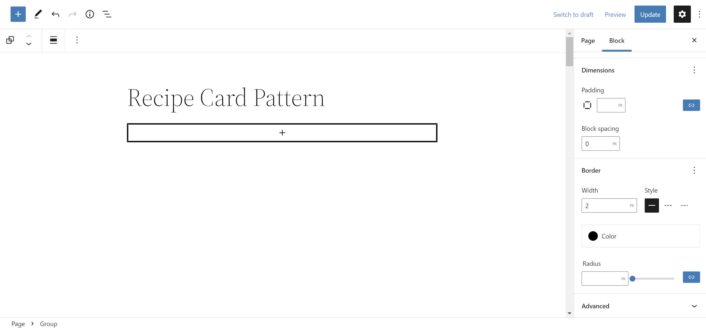
Step 1: Card Group
Let us kick this walkthrough off with something simple. There is no need to complicate matters this early.
Open a new post or page in your WordPress admin and add a Group block. In the block options panel on the right, look for the “Dimensions” section and set the “Block spacing” option to 0. This is necessary to get the card design we are after. Then, add a border of your choosing.
Note: you can add a background color for the entire card during this step. However, if you do, WordPress will add some default padding. So, you will also need to set the “Padding” option to 0.
Step 2: Card Image Header
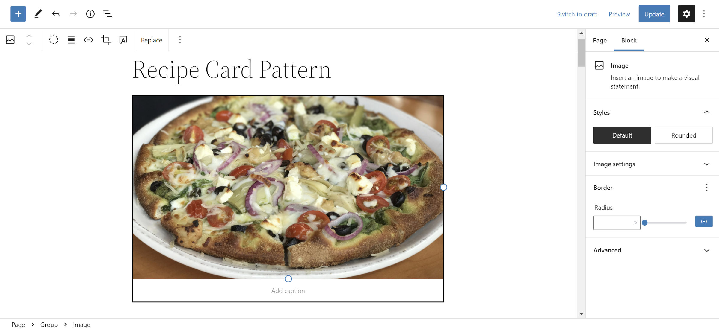
This is the first moment where you can really make a decision about your card. The two most obvious choices for a recipe card image are the Image and Cover blocks. I chose an Image and placed it into the Group block from Step #1.
The veggie pizza image is by Jennifer Bourn and is available in the WordPress Photo directory.
If you decide to add a Cover block, you can add the recipe title and description from Step #4 inside of it.
Step 3: Card Content Group
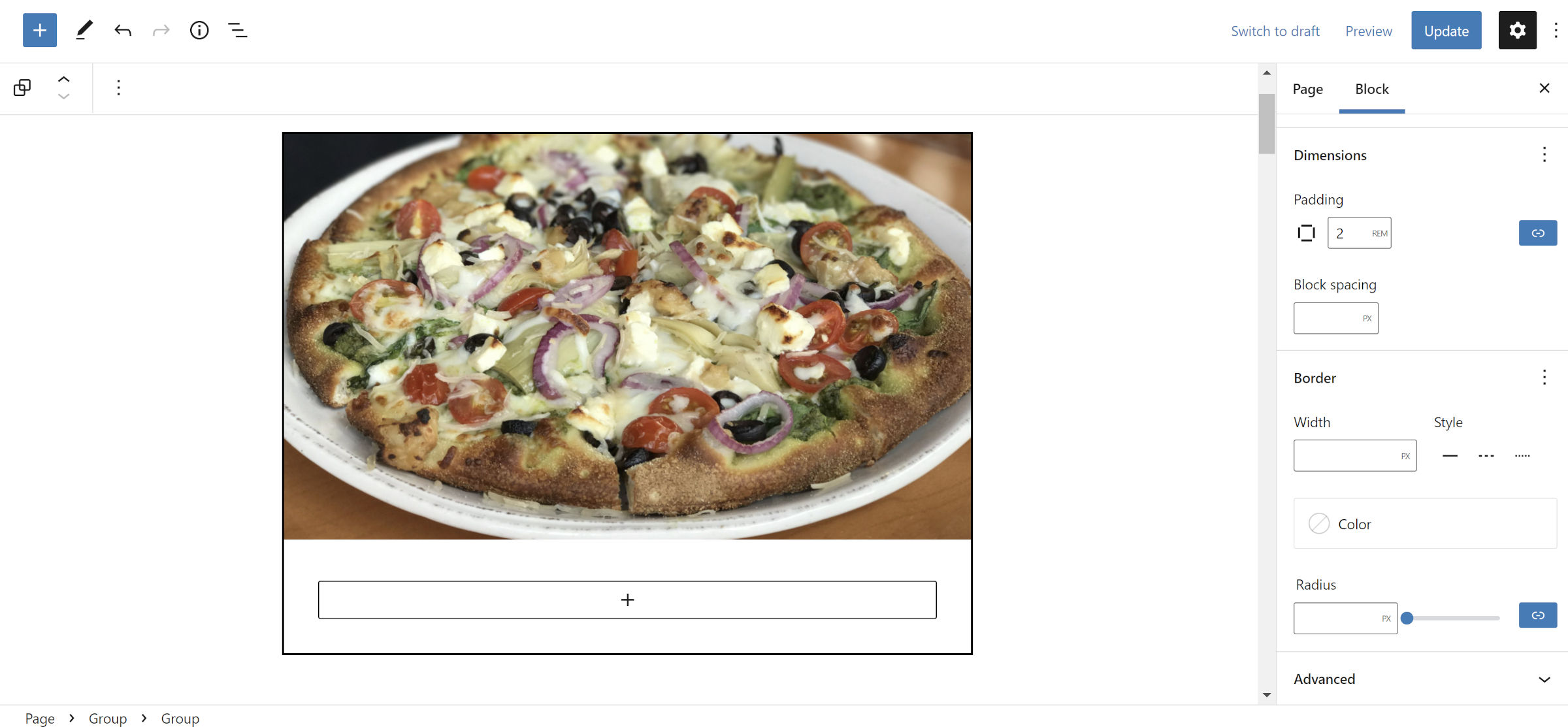
Let us continue keeping things simple for now. We need to group the “contents” of the recipe card together. Again, add a new Group block.
The only change you need for this block is to add some space around it. In the block options panel in the sidebar, set the “Padding” option to 2rem or your preferred value.
Step 4: Card Title and Description
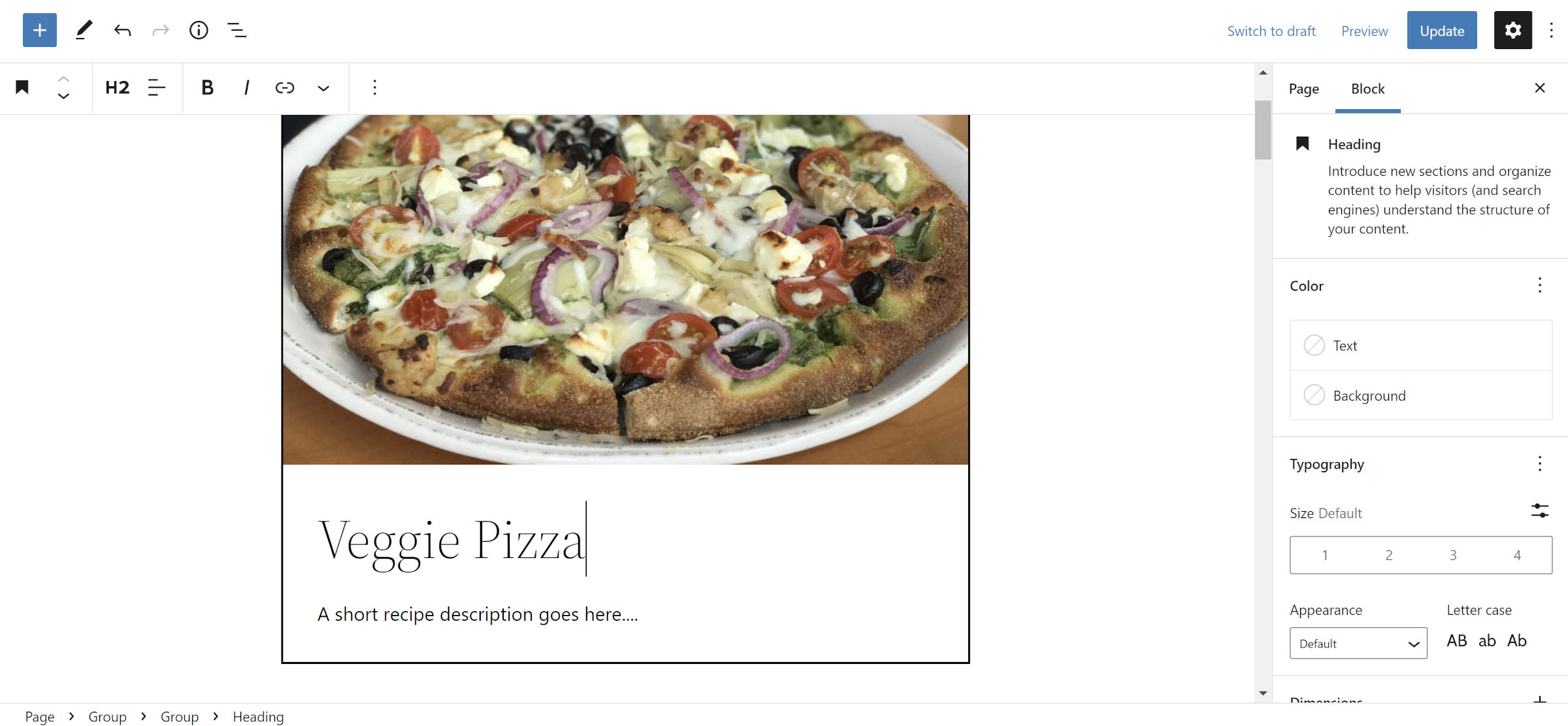
Inside the Group block from Step #3, insert a Heading block. Use this for the title of your dish. Then, insert a Paragraph immediately after for a description.
This is more of a free-form step, so go crazy with as much or as little detail as you want to add.
Step 5: Card Meta
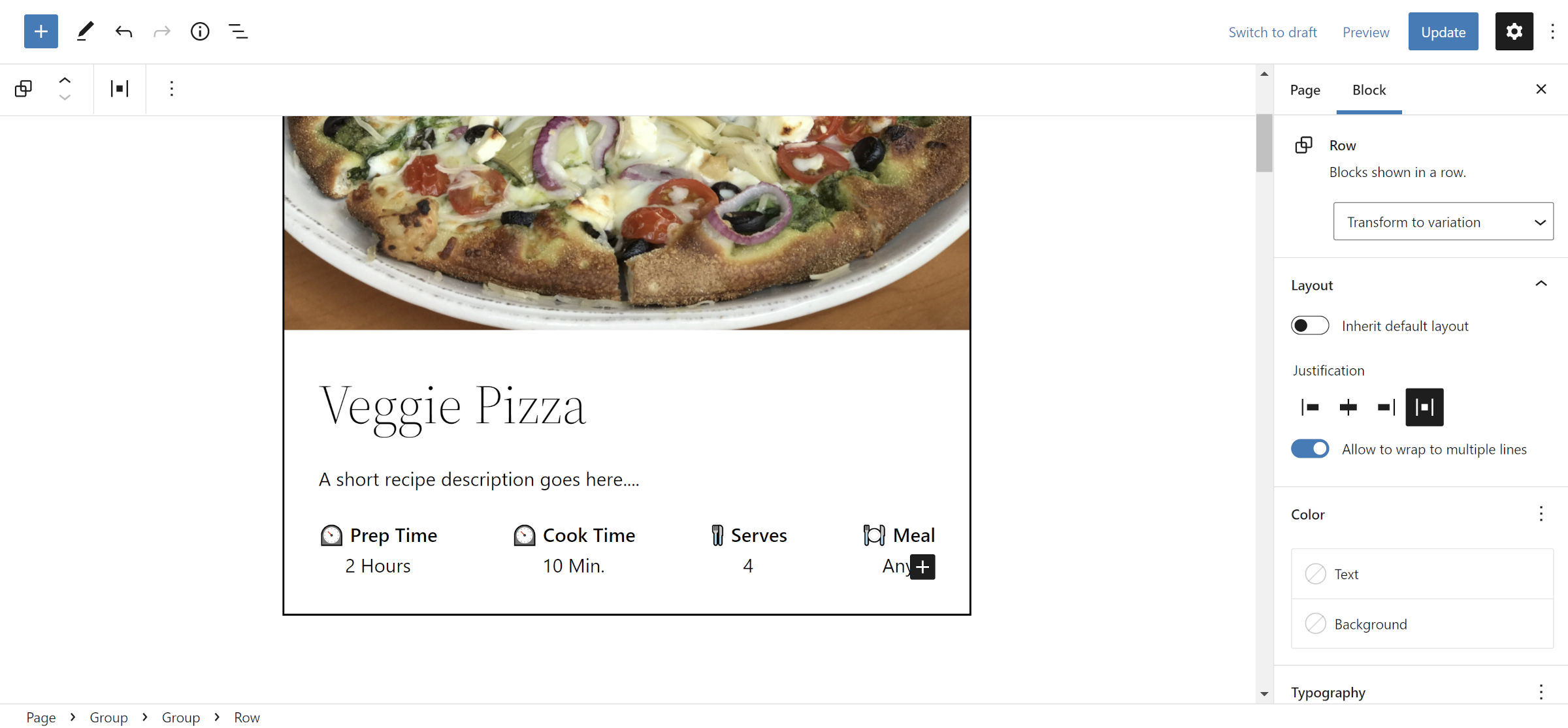
Thus far, everything should have been relatively straightforward. The previous four steps did not do anything complicated with the layout. This about to change.
You need to create a four-column section showing cooking times and other recipe metadata for this step. The best solution in WordPress for this is the Row block. If you want, you can try it with Columns. Both experiences can feel a bit janky in small spaces.
Add a new Row block inside the Group block you have been working in. I selected the “Space between items” option for the “Justification” control. This makes sure that everything is evenly spaced, but the choice is yours.
Then, click the “+” icon in the Row and add a Paragraph block inside it. For my first Paragraph block, I added the text “Prep Time” first. Then, I hit Shift + Enter on my keyboard to create a line break and added “2 Hours.” For fun, I popped in an emoji.
The trick to making the rest of this easy is to get the first Paragraph block styled just like you want, duplicate it three times, and customize the text.
Step 6: Card Ingredients and Directions
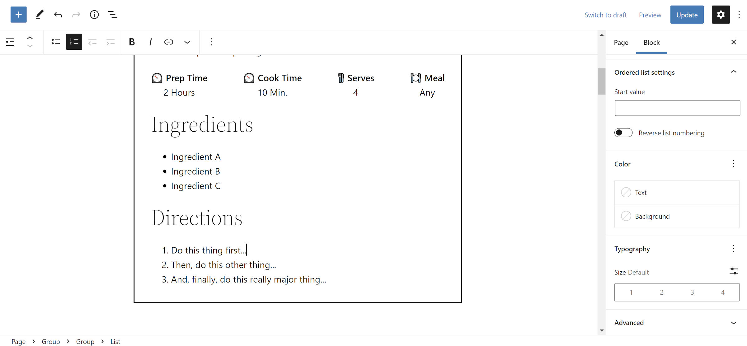
The hard part is out of the way. I promise. This next step is as simple as adding Heading and List blocks for an Ingredients section and doing the same for a Directions section. These should still be placed in the same Group that the previous blocks were in.
For the Heading blocks, I set the level to H3. The only other settings change I made was to select the “Convert to ordered list” button in the toolbar for the list under Directions.
Step 7: Card Social Sharing
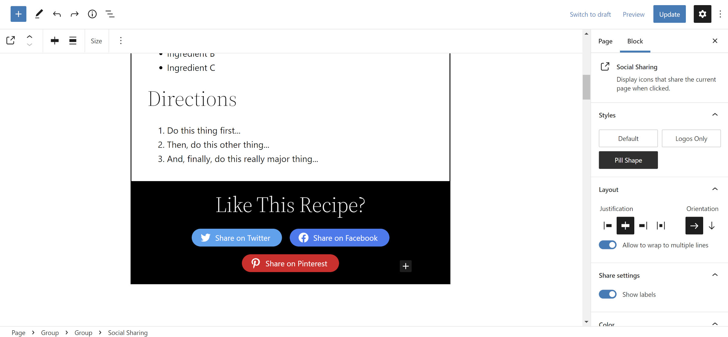
You cannot have a modern recipe card without a social section, right? You will need the Social Sharing Block plugin installed for this. Or, you can stop now with your completed card.
For this section, insert a new Group after (not inside) the Group used to house the recipe content. Change the text color to white and add a dark background color. You can also tinker with the padding (I set it to 2rem) or use a Spacer block if you want extra breathing room.
For the “Like This Recipe?” text, add a Heading block with the H3 level. Then, insert the Social Sharing block below it. Feel free to play with the design. I used centered justification and enabled the “Show labels” option.
That is a wrap!
Notes and Other Thoughts
I wanted to use core WordPress blocks for everything in this recipe card. The social sharing section was the obvious roadblock. The much faster option was to go with the third-party plugin.
Compared to many modern recipe cards that I have seen around the web, this solution still lacks two features:
- Task-style checkboxes or radio inputs for crossing out ingredients or steps.
- A “print this recipe” button.
For the task list, the Todo Block plugin by David Towoju works as a great alternative to the List block. It is lightweight and will allow site visitors to cross out items as they work through the recipe.